Deciphering POB’s artistic process
How does POB generative art process work?
POB is a project where you, the cryptoart collector, participates in the creative process. As the full name suggests, Proof of Beauty enables the community to ‘prove’ a potential $HASH token is ‘beautiful’ by minting the artwork.
Each $HASH token is unique and represents a single transaction. In later posts, we will highlight the reasoning behind the token mechanics around $HASH.
How are each artwork drawn? What do each of these ‘features’ mean?
…
Let’s break the process down.
In detail:
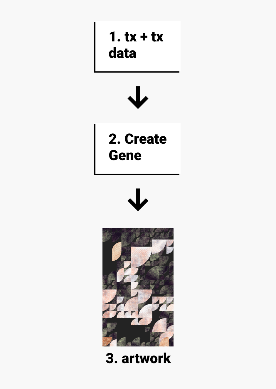
With a tx hash, POB fetches metadata related to the transaction from Ethereum nodes.
With the blockchain transaction data as a source of truth, a ‘gene’ is created that describes all the parameters to produce a generative artwork. The ‘gene’ traits are directly correlated to transaction data.
With the gene, an artwork can be produced by the generative process; the output is what you see on pob.studio.
For the curious and developer minded, feel free to browse the open-sourced gateway to learn about the nuances of how the three steps above are achieved.
In the UI, six ‘traits’ are highlighted to help art collectors and speculators get a sense on how the artwork is drawn. By no means are these labels ‘visually’ accurate and only represent what the traits numerically represent. I hope that the following quick read will help explain, in layman terms what these traits suggest about the artwork.
Texture
POB leverages a comic book inspired ‘dot texture’ to provide visual complexity to the quarter circles. The effect helps to introduce subtle color changes, noise, and visual focus to the artworks.
Texture in the artwork is loosely derived with the following formula:
const texture = gasUsed / gasLimit;When gas used is closer to the gas limit, the dot grid is denser and creates a visually ‘smooth’ grain texture.
Here is an artificially induced ‘low’ texture artwork to help highlight the contrast.
With this trait design, hopefully artworks with lower texture values are rarer and more valuable.
Grid
The ‘grid’ trait perhaps is the most influential trait. Larger grids mean the quarter circles are drawn bigger and smaller grids, smaller quarter circles.
The grid size is dictated by gas price. The lower the gas price, the smaller the grid, and vice-versa.
With this trait design, hopefully larger more visually ‘strong’ artworks are rarer as high gas price transactions are fewer.
Complexity
Complexity is a very ambiguous trait. It generally describes the compositional design of the artworks. Should this area be left empty, or that area? Higher complexity doesn’t imply an artwork is visually better, but offers opportunities for more unique outputs.
Complexity is linearly related to the nonce. The higher the nonce, the higher the complexity value.
While complexity value doesn’t tie to an artworks visual quality, it does allow for more interesting artworks. It is left to art speculators and collectors to be the judge of its quality.
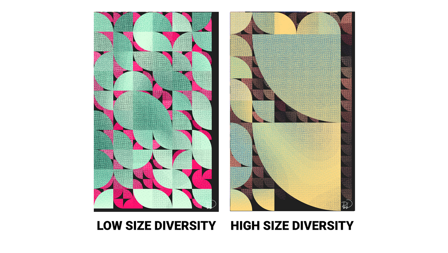
Size Diversity
For each color palette, the quarter circles are drawn in a number of varying sizes. The chance for larger size circles to occur is linearly related to the amount of ETH transferred in the transaction.
The higher the ETH, the higher the chance you see a diverse collection of quarter circle sizes in the artwork.
Number of palettes
To pay homage to proof of work, POB uses a similar mechanism to determine the number of palettes in the artwork.
All artworks will have two palettes at the minimum. Each palette dictates a layer of quarter circles seen in the artwork. Some transactions will have more palettes. The number of palettes is largely dictated by the number of leading zeros in the hexadecimal hash string.
// 2 color palettes
0x5FC0F...
// 3 color palettes
0x0AB15...
// 8 color palettes ???
0x00000...The next question to ask: how are the palette colors chosen?
Each color palette is deterministically picked with an address; as in, an Ethereum address maps to a color palette.
colorPalleteDeterminer(address) => 4 colors;Some popular addresses are mapped to their own brand colors while most other addresses map to POB’s own collection of palettes.
The final part: which addresses are used to select the x palettes used in the artwork?
The art process uses this format of addresses:
[ toAddress, fromAddress, addressFromLogs[0] ... addressFromLogs[x] ]If there is one leading zero, then the addresses used would be:
[ toAddress, fromAddress, addressFromLogs[0]]Color palette for an address can be easily viewed by the following link:
https://pob.studio/palette/0x7a250d5630b4cf539739df2c5dacb4c659f2488d
Input any address in the place of 0x7a250… to see what color palette you would expect from a transaction that interacts with the address in the link.
To note, I glanced over some of the design details with how color palettes are selected, consult the code to learn more.
Hopefully the trait designs spurs collectors to ‘mine’ and collect artworks that are historically relevant and visually interesting. Some visual features are rarer and may be assessed at a higher value. Getting the ‘just right’ amount of each trait to create a desired aesthetic will be a unique skill developed by a few in the community. These specialists, like historians, can be unique speculators at play in the POB ecosystem.
Again, this post highlights the general patterns you should expect; to learn about it more in detail, I urge you to skim the IPFS gateway codebase.
Follow the newsletter to learn more about POB, the thinking behind the project, and what is next on the horizons.


